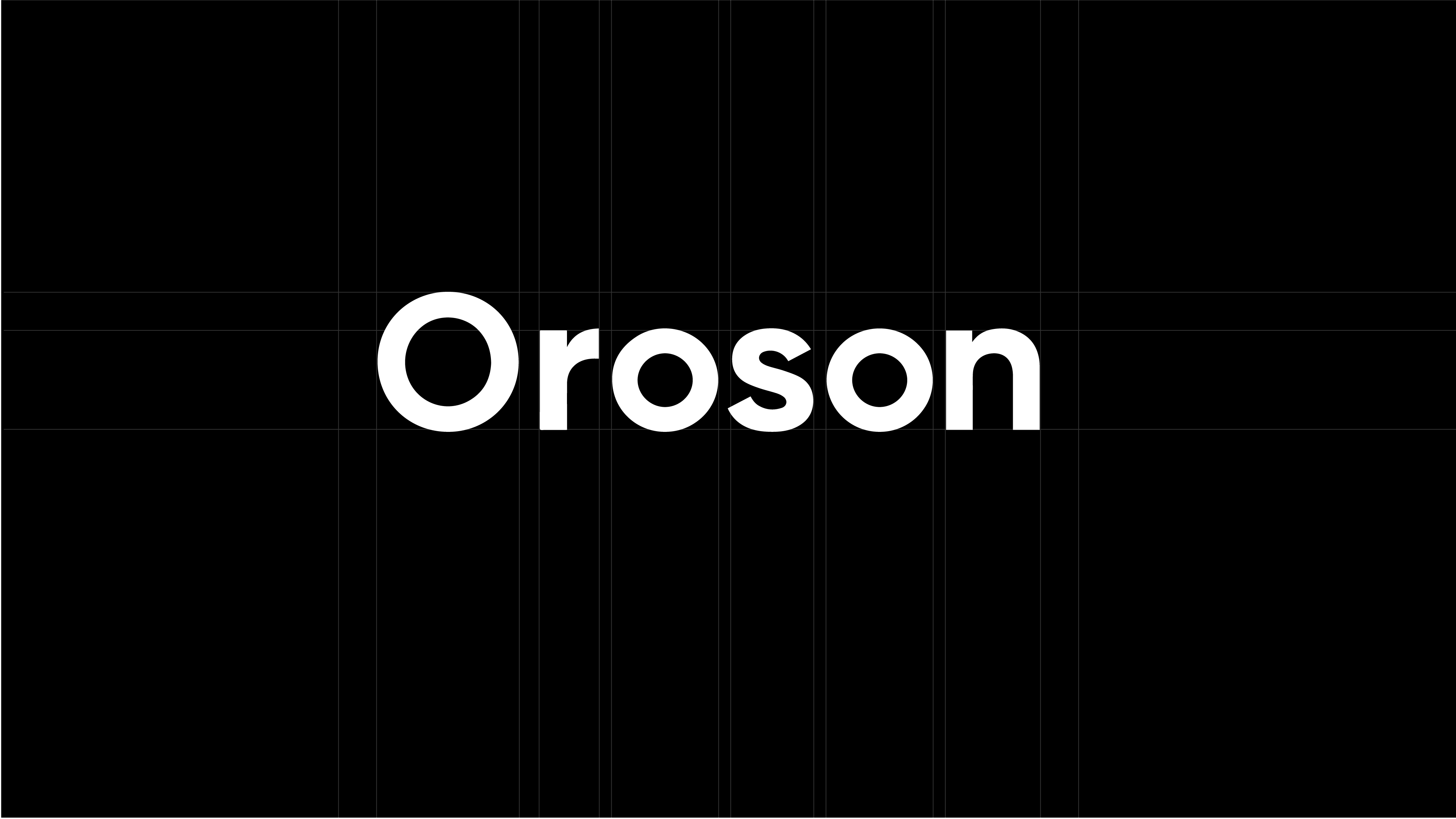
Oroson, an online platform for sharing work and collaboration, approached us to execute a complete rebranding. Their existing brand lacked cohesion and clarity, making it difficult to stand out in the competitive landscape of online collaboration tools. Our goal was to refine the brand identity, ensuring it aligned with Oroson’s core values of focus, clarity, simplicity, and contrast.

Oroson’s previous branding lacked a distinct personality, making it difficult for users to connect with and instantly recognize the platform. The brand needed a structured visual identity that communicated the platform’s purpose and usability effectively.

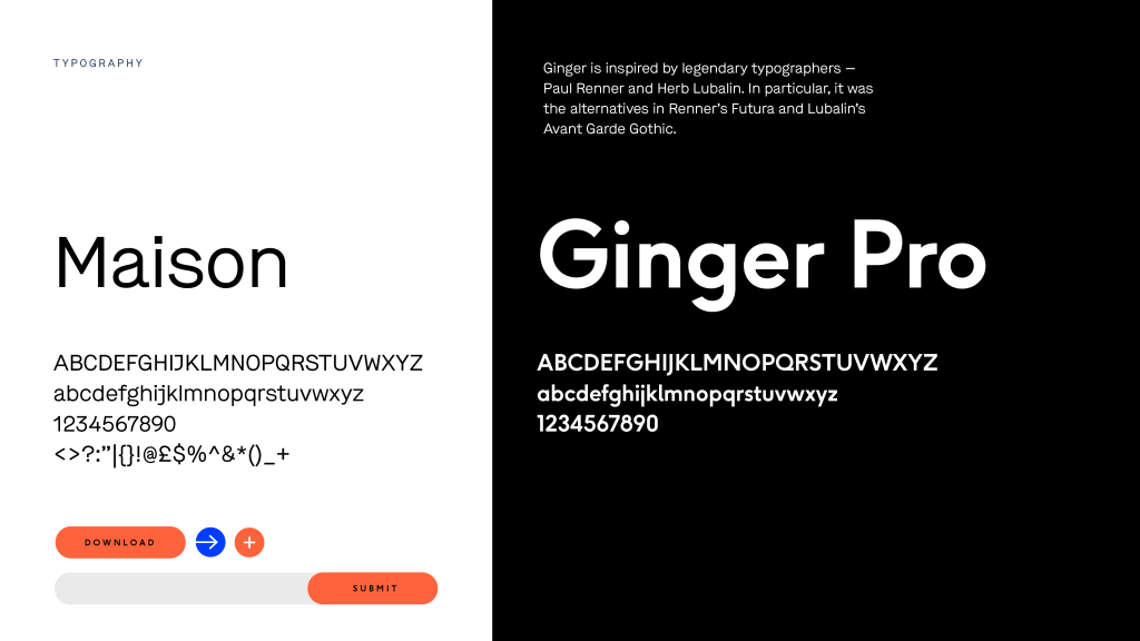
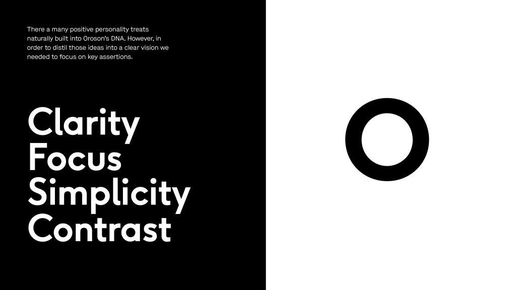
We embarked on a comprehensive rebranding process, ensuring every visual and design element reinforced Oroson’s principles. Our key focus areas were:

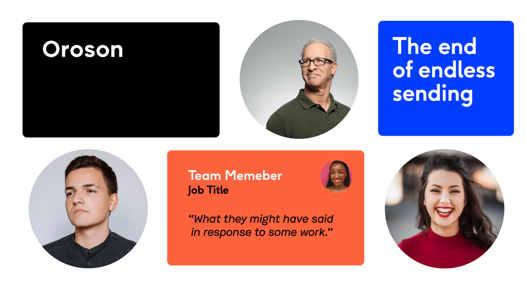
The new branding successfully transformed Oroson into a visually compelling and recognizable brand. The refined logo, structured design system, and improved color contrasts created a stronger visual identity. This overhaul provided Oroson with a solid foundation for future marketing and user engagement efforts, making it a standout collaboration platform in its industry.


This branding refresh for Oroson showcases the power of strategic design in redefining a digital brand’s presence. By emphasizing focus, clarity, simplicity, and contrast, we delivered a solution that not only elevates aesthetics but also enhances user experience. The brand now has a cohesive identity that resonates with its audience and supports its growth in the online collaboration space.
